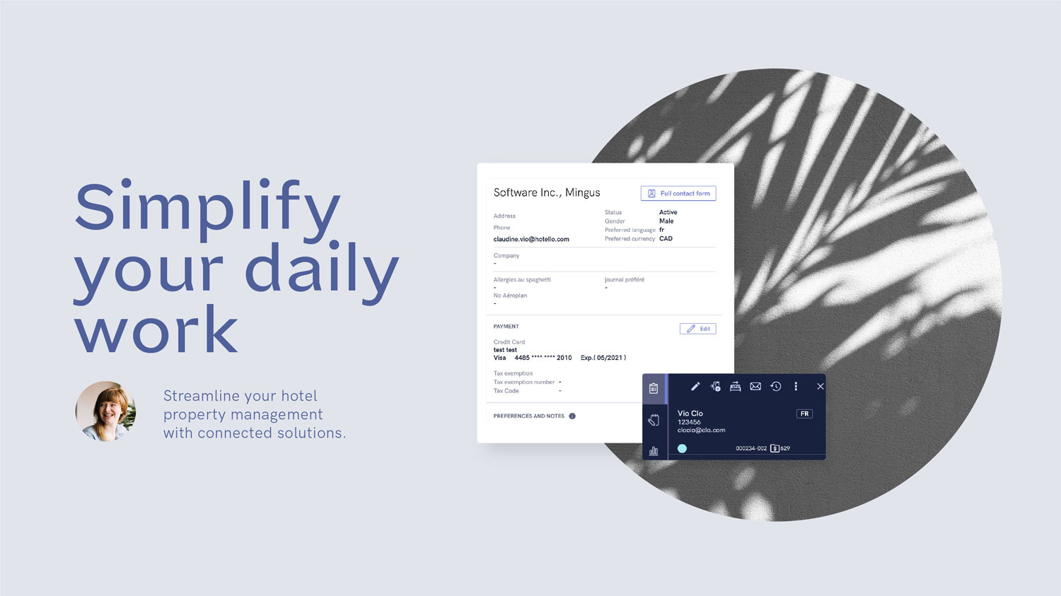
Hotello
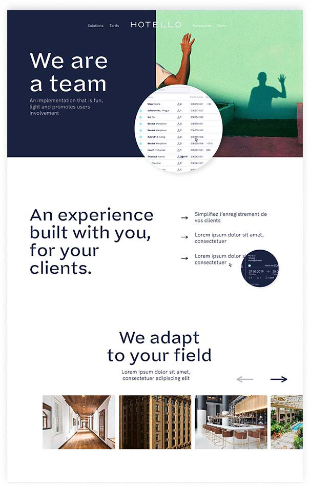
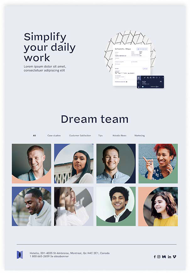
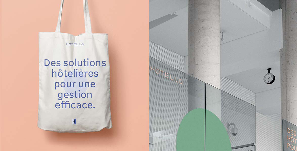
The Hotello team decided to go with a complete rebranding in order to accompany the redesign of their Hotel Management Software. Following several workshops done with their team, I offered them an original recipe combining elegance, technology, movement and fun.
Client : Hotello
Year : 2020
Branding
Art Direction
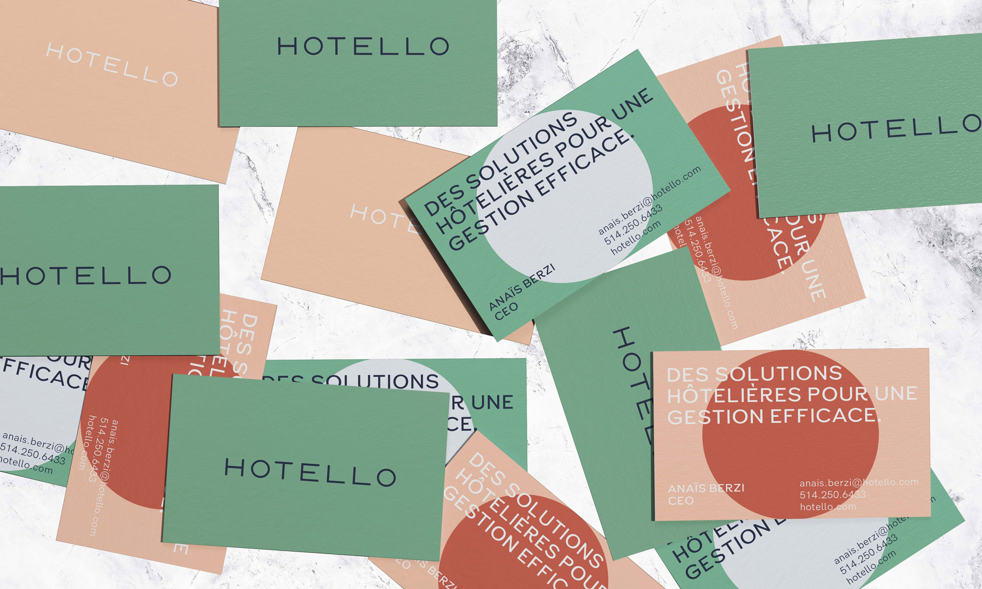
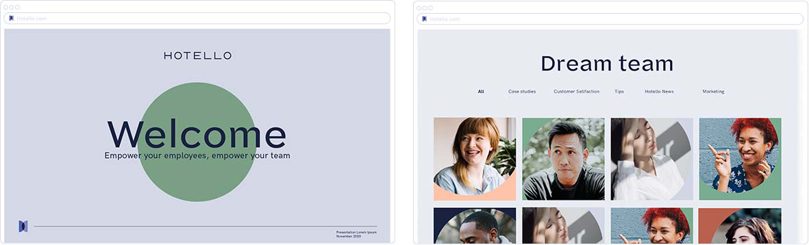
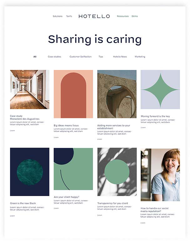
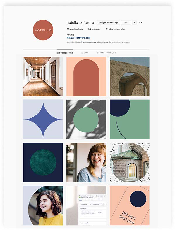
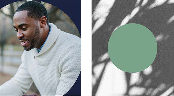
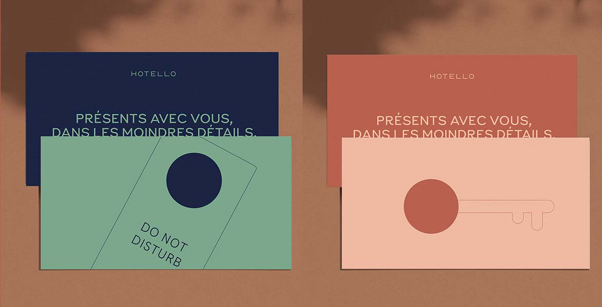
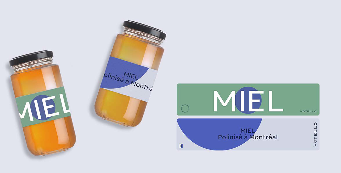
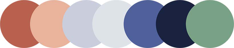
The circle
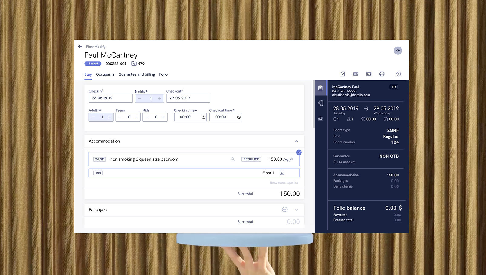
Hotello covers all the functionalities necessary for hotel management, everything happens "through" Hotello. In order to symbolize this thought, we have extracted the O's of the logo, circles which become a “window”, an encompassing symbol.


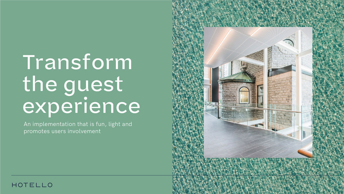
Using textures allows to brings life and elegance to Hotello's branding. Also we pay tribute here to the hospitality industry.
Materials also becomes a means of adapting communication to the target concerned : Resorts, rental buildings, hotels with services.